
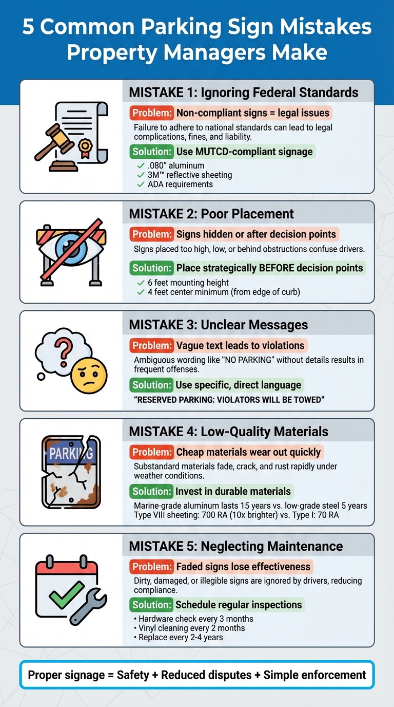
Parking signs are essential for keeping properties safe, organized, and legally compliant. However, property managers often make five key mistakes that lead to confusion, safety risks, and enforcement challenges. Here's a quick breakdown of these mistakes and how to fix them:
- Ignoring Federal Standards: Non-compliant signs can result in legal issues and enforcement problems. Use MUTCD-compliant signage with proper dimensions, reflectivity, and ADA requirements.
- Poor Placement: Signs that are hard to see or positioned after decision points confuse drivers. Place them strategically where they're visible and easy to understand.
- Unclear Messages: Vague or overly generic signs lead to parking violations. Use direct, specific language to communicate rules and consequences.
- Low-Quality Materials: Cheap signs wear out quickly, reducing visibility and compliance. Invest in durable materials like aluminum and high-grade reflective sheeting.
- Neglecting Maintenance: Faded or damaged signs lose their effectiveness. Schedule regular inspections and repairs to keep signage in good condition.
Takeaway: Proper signage ensures safety, reduces disputes, and simplifies enforcement. Review your parking lot today to identify and fix these common issues.
5 Common Parking Sign Mistakes Property Managers Make and How to Fix Them
Mistake 1: Failing to Meet MUTCD Standards
The Problem: Signs That Don't Meet Federal Requirements
It's a common misconception among property managers that parking lot signs are free from federal regulations. While the MUTCD (Manual on Uniform Traffic Control Devices) might not apply to every parking lot - especially private facilities with limited access - many local jurisdictions adopt MUTCD standards or similar DOT guidelines. These rules exist to promote uniform, safe, and enforceable signage. Without compliant signs, property managers may face challenges enforcing parking rules, such as towing unauthorized vehicles or issuing fines for violations. On top of that, failing to install ADA-compliant signs for handicapped parking can result in penalties.
Compliance involves specific details like sign dimensions, text size, symbols, retroreflectivity, and mounting height. Ignoring these standards can make signs difficult to read - especially from a distance or in low-light conditions - leading to driver confusion and even obstructing emergency vehicle access. Poor signage can also result in blocked fire lanes and parking disputes, both of which compromise safety on the property.
The Solution: Use MUTCD-Compliant Signs
The best way to avoid these issues is to ensure your parking lot signage complies with established guidelines from the start. For example, TrafficSafetyHQ offers parking signs made with .080" aluminum and 3M™ reflective sheeting, providing excellent visibility during both day and night.
Property managers should reference the latest MUTCD edition, such as the 11th Edition, which takes effect on January 18, 2024, and is available for free at mutcd.fhwa.dot.gov. Additionally, check for any state-specific requirements or supplements to ensure full compliance. When ordering signs, verify that they meet standards for mounting height, color codes, and text size. For ADA-compliant spaces, confirm the signage meets all accessibility requirements. By investing in high-quality, compliant signage upfront, property managers can avoid legal headaches and create a safer environment for everyone using the parking facility.
Mistake 2: Incorrect Sign Placement
The Problem: Signs Drivers Can't See
Even if parking signs meet all compliance standards, they’re useless if drivers can’t see them when it matters. A common issue arises when property managers place signs after critical decision points. For instance, a "Reserved Parking" sign positioned beyond the point where a driver needs to make a choice forces them to backtrack or loop around.
Obstructions like trees, overgrown bushes, light poles, or even parked vehicles can block signs from view. Signs that are mounted outside a driver’s natural line of sight can go unnoticed, and grouping too many signs together or overloading them with information makes it harder for drivers to quickly understand the message.
"The signage needs to be in the correct position and in the diagram below, you can see that as they're walking toward the sign, they have time to make the correct decision." - Dr. Paul Symonds, Travelwayfinding.com
When signs are poorly placed or blocked, drivers might unknowingly park in restricted spaces, block fire lanes, or occupy ADA spots - not out of negligence but simply because they didn’t see the restrictions. This creates enforcement headaches and could even lead to liability issues for property managers. Clearly, visibility is key to effective signage.
The Solution: Follow Placement Best Practices
The first step to proper sign placement is ensuring they’re positioned before decision points. These include intersections, pedestrian crossings, and entry or exit areas, giving drivers enough time to read and respond.
"Signs should be placed strategically where they are most visible to drivers and pedestrians. This includes decision points like intersections within the parking facility, near pedestrian crossings, and at entry and exit points." - Operations Commander
Mount signs at an appropriate height - typically around 6 feet, with the center at least 4 feet high - to ensure they’re easily visible. For ADA signs, make sure they’re not obstructed by parked vehicles. Always check local regulations for specific mounting requirements.
Walk through your parking lot as if you’re a driver to evaluate sight lines. Trim or remove any obstructions like overgrown foliage, and avoid clustering too many signs in one spot. At entrances, use larger signs with clear, simple messages that drivers can read from a distance. Reflective signs, such as those made with 3M™ sheeting, improve visibility both day and night - but only if they’re positioned thoughtfully. To minimize confusion, keep signage concise and avoid overcrowding spaces with unnecessary signs.
Proper placement ensures drivers can see and understand parking rules, reducing mistakes and making enforcement easier.
Mistake 3: Confusing Sign Messages
The Problem: Vague or Generic Text
Unclear signs can leave drivers scratching their heads and make enforcement a nightmare. Take an ambiguous "Reserved Parking" sign, for example - it doesn’t explain who can park there, when it’s enforced, or what happens if you break the rules. This lack of detail creates uncertainty for drivers and makes it harder for property managers to enforce parking policies effectively.
Signs that send mixed messages - like conflicting timeframes or missing directional arrows - only add to the confusion. Imagine trying to follow the rules but still getting towed because the sign wasn’t clear enough. It’s frustrating for drivers and complicates enforcement even further.
"Effective parking signs need to include three key elements: Spot designation, Usage rules, Enforcement consequences." - Hannah Michelle Lambert, Content Writer, Parkade
A vague "No Parking" sign, for instance, doesn’t tell drivers when it applies or what the consequences are, leaving everyone guessing.
The Solution: Write Clear, Direct Messages
The fix? Use clear, no-nonsense language on parking signs. Be specific and action-oriented. Instead of a generic "Reserved Parking", go with something like: "RESERVED PARKING: VIOLATORS WILL BE TOWED AT VEHICLE OWNER'S EXPENSE."
"The design of parking signs should prioritize clarity and readability. This includes choosing the right font size, color contrast, and sign placement. A well-designed sign conveys its message quickly and effectively to drivers and pedestrians." - Operations Commander
Keep your messages brief and to the point. Use high-contrast color schemes - like black text on a white background or red on white - for better visibility from a distance. To eliminate any lingering doubts, post detailed parking rules at every entrance and exit. Include specifics like registration requirements, enforcement methods, and contact information. This approach ensures drivers know exactly what’s expected and reduces unnecessary confusion.
Mistake 4: Choosing Low-Quality Materials
The Problem: Signs That Wear Out Quickly
Opting for cheap, low-quality materials might save you money upfront, but it often leads to much higher costs over time. For example, while marine-grade aluminum can last up to 15 years, low-grade steel often rusts within 5 years, significantly increasing replacement expenses. Harsh weather only speeds up this deterioration, making these materials a poor long-term choice.
Another issue is poor reflectivity. Low-grade reflective materials fail to bounce back headlight beams effectively, making signs almost invisible at night. This creates serious safety concerns and can even result in non-compliance with federal regulations. In fact, the Federal Highway Administration (FHWA) requires all traffic signs to meet specific retroreflectivity standards outlined in the 2009 Manual on Uniform Traffic Control Devices (MUTCD). Type I engineering-grade sheeting, commonly used in cheaper signs, doesn’t meet these requirements for critical warning and guide signs.
The Solution: Opt for Aluminum and High-Quality Reflective Sheeting
When it comes to durability, aluminum is a top choice. Many agencies prefer .080" aluminum because it's strong, recyclable, and reusable. With a lifespan ranging from 7 to 15 years - and even up to 20 years with minimal upkeep - it’s a reliable investment.
For reflectivity, it’s wise to skip Type I engineering-grade sheeting. Instead, go for higher-grade options like Type III (High Intensity) or Type VIII (Prismatic). These materials offer significantly better brightness and longevity. For instance, Type VIII sheeting achieves up to 700 RA (a measure of brightness), compared to just 70 RA for Type I - a tenfold improvement. According to the FHWA, "The higher level sheeting types will provide a brighter sign and in general have a longer service life, allowing for an overall cost savings."
| Material Type | Durability Benefit | Compliance Standard |
|---|---|---|
| .080" Aluminum | 10-Year Life | FHWA, ASTM D4956 |
| 3M High Intensity Prismatic | Enhanced Visibility | MUTCD |
Local climate conditions also play a big role in material selection. Salt air, intense UV rays, or freeze-thaw cycles can dramatically shorten a sign’s lifespan if you use inferior materials. Investing in durable materials that last at least 10 years is far more economical than replacing cheaper options every year. Not only does this approach save money in the long run, but it also ensures compliance with safety regulations and keeps roadways safer for everyone.
sbb-itb-5d58da3
Mistake 5: Skipping Sign Maintenance
The Problem: Faded and Damaged Signs
Even the best parking signs can’t hold up indefinitely without care. Over time, they fade, get damaged (bent, twisted, or even broken), or fall victim to vandalism - think graffiti, peeling paint, or misaligned posts. When this happens, their visibility and purpose take a hit.
And it’s not just about appearances. Faded numbers, unclear markings, and illegible signs can confuse drivers and lead to parking violations. Neighbor.com emphasizes this point: “It's essential to clearly define restricted parking areas, both for conformity and enforceability's sake. Note that it's illegal to tow away vehicles or fine individuals for parking violations if there aren't signs clearly posted.” Poor signage isn’t just inconvenient - it can open the door to legal disputes and create enforcement headaches.
The Solution: Schedule Regular Inspections
The fix? Routine maintenance. A proactive approach ensures your signs stay visible, readable, and compliant. Set up a maintenance schedule to tackle common issues like fading, loose hardware, or graffiti. After severe weather, inspect signs immediately to catch any new damage.
Different types of signs need different levels of care. Here’s a quick guide:
- Mounting hardware: Check every three months to ensure stability.
- Vinyl graphics: Inspect every two months for peeling or bubbling.
- UV-resistant coatings: Reapply every six months to prevent fading.
- High-traffic outdoor signs: Look for vandalism weekly and clean them every two weeks.
As a general rule, replace worn or non-compliant signs every 2 to 4 years. Staying on top of these tasks not only keeps your signage in good shape but also ensures they remain effective and enforceable. Regular upkeep is the finishing touch to proper sign design and installation.
Faded, Damaged, Obscured Parking Signs Leave Drivers Mystified
Conclusion
Parking signs might seem straightforward, but the five common mistakes - ignoring MUTCD standards, placing signs incorrectly, creating confusing messages, using poor-quality materials, and neglecting maintenance - can seriously impact safety, traffic flow, and legal compliance.
Fortunately, these issues are easy to address. The solutions are clear: choose MUTCD-compliant signs that meet federal guidelines, position them where they're easily seen and understood, ensure the messaging is simple and direct, opt for durable aluminum with reflective sheeting designed to last 7–10 years, and schedule regular inspections to keep signs in top condition.
By taking these steps, you can avoid legal headaches, minimize driver confusion, and keep traffic moving smoothly. Well-placed, clear, and properly maintained signs benefit everyone - drivers can park without guesswork, enforcement becomes straightforward, and your property operates more efficiently.
Take a moment this week to walk through your parking areas. Check if your signs follow MUTCD standards, are easy to spot, and provide clear instructions. Making these adjustments now can create a safer, more organized environment for everyone using your lot.
FAQs
What are the benefits of using parking signs that follow MUTCD standards?
Using MUTCD-compliant parking signs plays a key role in maintaining consistency and clarity for drivers. These signs follow nationally recognized standards, which help improve safety, manage traffic flow more effectively, and minimize confusion with clear, standardized messaging.
Sticking to MUTCD guidelines also protects property managers from potential legal troubles since these signs meet all regulatory requirements. By choosing signs designed for visibility and uniformity, you create a safer, more organized parking experience for everyone involved.
What’s the best way to make sure my parking signs are easy to see and properly placed?
When setting up parking signs, it's crucial to ensure they're easy to spot and positioned where they make the most sense. Focus on placing them in high-traffic areas like entrances, exits, intersections, and pedestrian crossings. To make them stand out, rely on high-contrast colors, large fonts, and reflective materials - this way, they’ll be noticeable both during the day and at night.
Mount the signs at a height of 5 to 7 feet, which aligns with a driver’s natural line of sight, and make sure they're free from obstructions like trees or parked cars. For nighttime visibility, opt for signs that are either illuminated or crafted with reflective materials. Don’t forget to routinely inspect and maintain them to ensure they remain clear, readable, and in line with local rules.
What are the best materials for durable and long-lasting parking signs?
When it comes to parking signs that stand the test of time, go for sturdy, weather-resistant materials like aluminum or heavy-duty PVC. These options are built to handle tough conditions - think rain, snow, and extreme temperatures - without wearing out quickly.
To make sure your signs are easily visible and meet safety standards, consider adding reflective sheeting. This feature boosts readability in all lighting conditions, ensuring drivers can spot and follow the signs during both daytime and nighttime. Choosing the right materials doesn’t just make your signs last longer - it also plays a key role in keeping your parking lot safe and organized.